 |
|
|
|
|
|
|
As far as I know, there have been three major publishers of Ann Petry's novel, The Street. Each one used a different cover image to sell the novel to readers. The most common publisher has used three different cover illustrations, in the 1940s, 1990s and now in the 2000s. Each of these cover illustrations sends different messages to the reader about the contents of the book.
 This
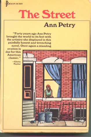
edition was first published by Beacon Press in 1985 as part of
their Black Women Authors Series. This cover is an interesting
combination of the first edition and
paperback covers. Like the first edition,
this cover emphasizes the book's literary merit. Where the first
edition emphasized Petry's Literary Fellowship, this edition uses
a quote from Gloria Naylor, a contemporary black woman author
of some reknown, to sell the novel's literary merits to the casual
reader. Naylor's quote is "Forty years ago Ann Petry brought
the world to its feet with the artistry she displayed in this
painfully honest and wrenching novel. Once again a standing ovation
is due for this American classic." In addition to selling
the literary qualities, the cover shows an illustration of the
street itself. This is the only edition to date that does not
show, or at least imply that it is showing, Lutie on the cover.
This
edition was first published by Beacon Press in 1985 as part of
their Black Women Authors Series. This cover is an interesting
combination of the first edition and
paperback covers. Like the first edition,
this cover emphasizes the book's literary merit. Where the first
edition emphasized Petry's Literary Fellowship, this edition uses
a quote from Gloria Naylor, a contemporary black woman author
of some reknown, to sell the novel's literary merits to the casual
reader. Naylor's quote is "Forty years ago Ann Petry brought
the world to its feet with the artistry she displayed in this
painfully honest and wrenching novel. Once again a standing ovation
is due for this American classic." In addition to selling
the literary qualities, the cover shows an illustration of the
street itself. This is the only edition to date that does not
show, or at least imply that it is showing, Lutie on the cover.
The background color is a light canteloupe orange that allows the image in the lower left corner to grab the casual viewer's attention. This image focuses on a Mrs. Hedges type character. However, the Mrs. Hedges being on the right side of the building and main entrance just feels wrong, somehow. Plus, this character is too small and young to really be Mrs. Hedges. The red bandana is clearly on her head, and once again she has on a greenish blouse, although here it is looser, as Mrs. Hedges is described as wearing, rather than the more traditional blouse shown on the paperback edition cover. A closer look at a larger version of the cover image will show you better.
What this cover does get better than the other versions is the impression of the street itself. This version of the street has trash in it. That seems minor, but almost every description of the street that Petry gives the reader makes mention of the trash, particularly paper, flying about and lying about. The paperback edition had some paper, but it was difficult to distinguish from the street itself. Here, there's no doubt in the reader's perception. The bent bars of the railing, as well as the cracked masonry around the windows imply struggle as well as a general lack of care. The varied color of the bricks is accurate, but also implies a tension and flaw in the foundation of the structure where these characters struggle to survive.
|
Covers HomePage |
 |

|
 |
 |
|
